Bold color and retro styles are not only about the past. I think they are great ways to make your photos feel new and different right now. There are so many photos everywhere, so using these styles can help you stand out and show your own way of seeing things.
Why bold color is back
For a long time, faded and moody photos were everywhere online and in ads. I think bold color is coming back because people got bored with that look. Bright colors really catch your eye, especially when you scroll through lots of small photos. They look good on screens, in prints, and even in videos. Using strong colors, like bright red or blue, can become part of your own style, just like how you frame your photos.
Screens today are vivid and packed with color, so bold colors just fit. Modern cameras and editing tools make it easy to use strong colors, much more than film ever did. This means we can play with color and contrast and still keep all the details in our photos.
Color as storytelling, not just style
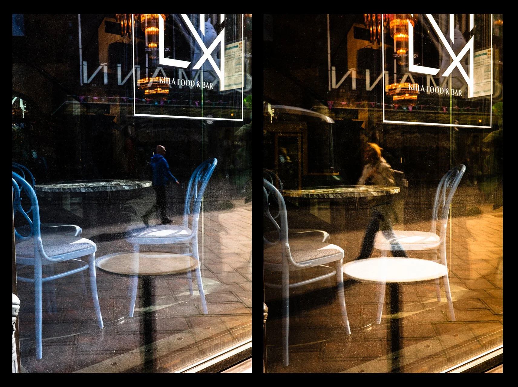
This change is not only about how photos look. It is also about telling a story. You can use strong color to:
Create a mood (warm oranges for closeness, harsh blues and greens for feeling distant or modern).
Direct the viewer’s attention in busy photos, especially in street and documentary photography, where the picture needs to make sense out of a lot going on.
Tie a project or series together, making the photos feel like parts of the same story instead of random, separate pictures.
If you use bold color on purpose, it can really help your story. For example, you can use yellow again and again in a street project to say something about city life. But if you make everything too bright, it can get boring and lose feeling. I think it is important to use strong colors with care, not just to make things look colorful.
The pull of retro aesthetics
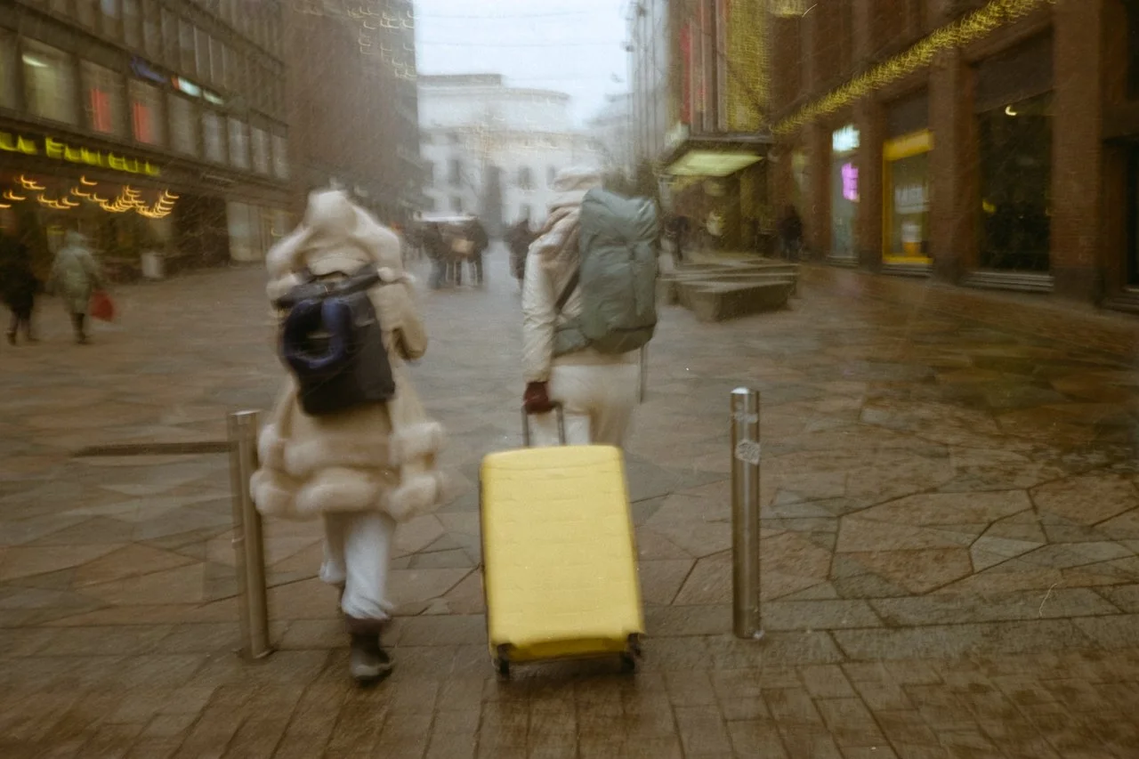
Retro styles like film grain, light leaks, glow, old lenses, and Polaroid frames remind us of real memories. Today, when AI and super clean digital photos can feel too perfect, these small “imperfections” feel more real. People see a bit of blur or grain as a sign of real life, not something fake.
Retro isn’t monolithic, either. It spans:
1970s warm, slightly faded Kodachrome vibes.
1980s and 1990s point‑and‑shoot flash with intense direct light and on‑camera glare.
Early‑2000s consumer digital with its particular sharpening, white balance, and color quirks.
Each time has its own feeling. A 90s compact camera look can make you think of family and old photo albums. A harsh flash can evoke a nightlife or DIY vibe. These styles can help your photos mean more.
Why retro resonates now
There is a bigger reason why these styles are popular now. When it is easy to fake photos, people want to see that a photo is real and from a real time and place. Retro details show how the photo was made. It feels like light touched film, chemicals changed it, and someone held the print. Even if you make the look on a computer, retro style shows skill and a connection to the history of photography.
Retro can also be fun. Some photographers mix old and new styles, like 1970s color with today’s fashion. I think this shows how culture repeats and how our memories keep changing.
Hybrid: retro look, modern freedom
What really changes photography today is mixing digital photos with retro looks. Now you can do things like this:
Take clear, flexible digital photos and then add film-like color, grain, and glow with a lot of control.
Use old lenses on new digital cameras, mixing the look of old glass with the quality of new sensors.
You can copy the look of a certain film for a whole project, which was really hard to do with real film. Now, retro is not a limit. It is more like a set of tools. You can pick what you like from the past and use it how you want, instead of being stuck with one film or camera.
Cliché and empty nostalgia are risks
Because these looks are so easy to get with presets and apps, there is a real risk that everything starts to look the same. If you just use a popular film preset or a trendy color, your photos can blend in with everyone else’s. Retro and bold colors cannot fix a boring photo. If the picture is not interesting, editing will not help. If the topic and story are not interesting, then even a special retro look or color palette will not help. A project about city change might use cool, strong colors and harsh flash to show tension. A series about family memories might work better with softer, pastel film looks and visible grain.
Practical ways to use these trends
For photographers looking to engage with these shifts without losing their voice:
Start by thinking about what your project is about. Then pick colors that help tell that story, not just a look you like. Try to see how color and imperfection were used before, and use them in your own way.
Try to use just a few colors or stick to one time period for a project. This way, your photos feel like they belong together, not just a mix of random filters. It helps your work feel more like a story.
Use retro tools like real film, old lenses, or special digital settings to find new ways to shoot. Do not just add them as decoration later. Try to make them part of your process.
Bold color and retro styles help photographers stand out and feel more real in a world full of perfect images. If you use them as part of your own style, more than a trend, they can make your photos feel more emotional and true to you.