
Peter Forsgård

photographer

  • Visual Trends in 2018

    Visual Trends in 2018

    I have had the habbit to write a blog post around New Years and predict things that will be trending in visual content creating. Well maybe its not a prediction, but rather some of my thoughts that comes to my mind reading about the trends.

    Raw and ready, really?

    In last years in my predictive blog post in December 2016 (in Finnish), I wrote a lot of about authentivity. That same trend seems to be the also the case in 2018. Article in Digital Art magazines websites says: …photography involves subjects represented as they are – raw and ready.” Of course this has to do with social media. It has changed photography, maybe for ever? We are more and more used to seeing straight photography again. Naturally there is still the question of image manipulation in its all forms. People still try to make expressions and for example “polish” their travel photos by shooting in places that gets a lot of likes in Instagram etc. 

    People are heroes!

    Another trends that seems to be rising, is that people are in the center. People become “the main heroes of their visual storytelling”. (source: Digital Arts). This trend is no surprise. We are, or should I say they, are taking more and more selfies. Those selfies are being shared in different social media platforms. Stories-feature in Facebook and Instagram are very popular. In those stories people are the heroes. This trend was already quite big last fall. Story telling is here to stay. People just love stories and social media platforms are made for story telling.  

    Dead Pan is back, ou no!

    Deposit photo listed photo trends for this year. Dead Pan photography has made a comeback. I think its because we want to made photography believable again. The truth of photography has been challenged by image manipulation. So its no wonder that deadpan aestetics is popular again. I have a mixed feeling about deadpan style. In portraiture its a no no for me, but in street photography and street portraits its very nice way. Dead Pan is usually described as “it is what it is”. That refers to the subject. The photographer just documents the scene and do not get involved in it in any way. I am not sure if this is a megatrend. When people take selfies or photos of their friends everybody seems to pose or at least try to look good as possible. You see people taking their time to shoot selfies. They use selfie sticks to get better composition. They take a lot of different ones to choose from etc.

    Harsh light is so 2017!

    Natural light and environment is preferred over controlled studio environment. The trend is moody lighting and darker midtones. (source: SLRLounge). This means that the times of harsh light is over for now, until it comes back…    

    Naturally video is still a big trend and its not going anywhere. It includes also moving images, cinemagraphs and gifs. I think livestreaming will come even more popular in 2018 compared to 2017. Equipment gets better and cheaper. It does not need any post production. When streamed you are ready to move on. Consumption of images has been a trend for a few years. We just scroll through images and the same will happen with videos, live and not-live. The time that people will watch a video is getting shorter. Its about 10 seconds and then we move on to the next video. I do not have statistics about live videos, but I would assume that its longer. 

    Horisontal is also ok!

    Another trend that was not mentioned in the articles that I read about visual trends was vertical video. All the main social media video platforms support vertical video. I think the reason for its popularity is mainly the way we hold our phone. Most just do not turn the phone horizontally when taking pictures or videos. For those who watches videos on laptop etc. its annoying. I do understand that there is a place for vertical videos. Street ad signs are often vertical especially in cities etc. In talking head -videos vertical is a good format just like in portraits. But vertically just because one does not think is just dumb.

    Millenium pink is out.

    Color are big part of visual trends. Pantone publishes The Color of the Year every year. This year its Ultra Violet (Pantone 18-3838). Millenium pink is out. Pantone also gives different color palettes to make differnet color combinations around Ultra Violet.

    Why does all these trends matter to a photographer or a videogrpaher? Watch the video below to find out.                  


  • Adobe is getting really serious with AI.

    Adobe is getting really serious with AI.

    Adobe introduced some new impressive AI driven features that are in the making. Adobe Sensei are the brains. As a photo and videographer the most impressive possible future features for me where of course the ones that had to with video and photography.

    Content Aware Fill is a great toll, but it does not work with every image and situation. Deep Fill is Content Aware Fill with steroids. It does not only analyze the surroundings, but it also tries to understand whats really underneath the element we try to fill. Another technology that tackles the same problem is Scene Stitch. I think its even more impressive than Deep Fill. Scene Stitch will replace a part of an image by going through millions of image from Adobe Stock. It uses part of an image that it finds from the stock and replaces the part that you have selected. Scene Stitch rises a few questions about copyrights and about the document value of a photograph. I understand that this is not a problem with design, illustrations, marketing and advertising. The problem might arise in those if it crosses documentary photography. It challenges the truth and the documentary value of a photograph. 

    Lets take an example that was pulled right out of Adobes YouTube-video about Scene Stitch.    
      

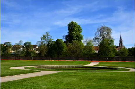
    Before (screenshot from Adobes YouTube-video)
    Before (screenshot from Adobes YouTube-video)
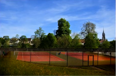
    On of the After photos that Scene Stitch suggested (screenshot from Adobes YouTube-video)
    On of the After photos that Scene Stitch suggested (screenshot from Adobes YouTube-video)

    Scene Stitch gives several suggestions. The user then can pick the one that works best. The tennis court is taken from a Adobe Stock photograph. The question that I think is that what kinda of a document is the after shot? The pond is replaced with tennis courts. There was no mentions in the presentation if someone gets paid when parts of the images will be used. I would assume that there will be money involved when stock image is used. At least I hope so.

    Of course these new features may or may not be part of future versions of Adobe Apps. Adobe is experimenting with different new things.

    Links to the videos in YouTube that I mentioned in the post:

    Scene Stitch

    Project Deep Fill
     

    The blogger is an Olympus European Visionary who´s native language is Finnish.


  • Big Mac vs. Whopper!

    Verkossa kiertää juttu jossa kerrotaan miten valokuvaaja Philippe Echaroux on käyttänyt Big Mac -boxia valonmuokkaajana. Valonlähteenä hän käytti taskulamppua.

    Matti Sulannon ja minun mielestäni asiaa piti tutkia vähän tarkemmin. Jotta Big Mac -boxin kyvyt valon muokkaajana tulee todella testattua piti se altistaa vertailuun. Vertailuun valitsimme toisen suuren ja tunnetun eli Burger Kingin Whopper-hampurilaisen kääreen. Valitettavasti kotimainen haastaja Hesburger ei ehtinyt mukaan kisaan.

    Valonmuokkaajien arviointikriteerit olivat: valon laatu ja luonne, valon väri, valon heijastuvuus, käytettävyys, kuljetettavuus sekä majoneesin määrä. Matin ja minun antamien pisteiden keskiarvo ratkaisee voittajan.

    1. Big Mac -boxi

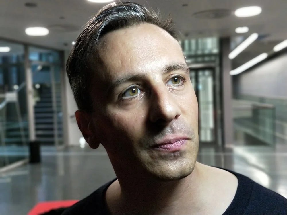
    1/50s f1.7, ISO1250
    1/50s f1.7, ISO1250

    1. Valon laatu ja luonne:
    Peter 8/10
    Matti  8/10

    2. Valon väri
    Peter 8/10
    Matti 9/10

    3. Valon heijastuvuus
    Peter 9/10
    Matti 8/10

    4. Käytettävyys
    Peter 7/10
    Matti 8/10

    5. Kuljetettavuus
    Peter 3/10
    Matti 5/10

    6. Sotkun määrä eli lähinnä majoneesi (mitä enemmän majoneesia sen pienempi numero)
    Peter 7/10
    Matti 8/10

    2. Whopper-kääre

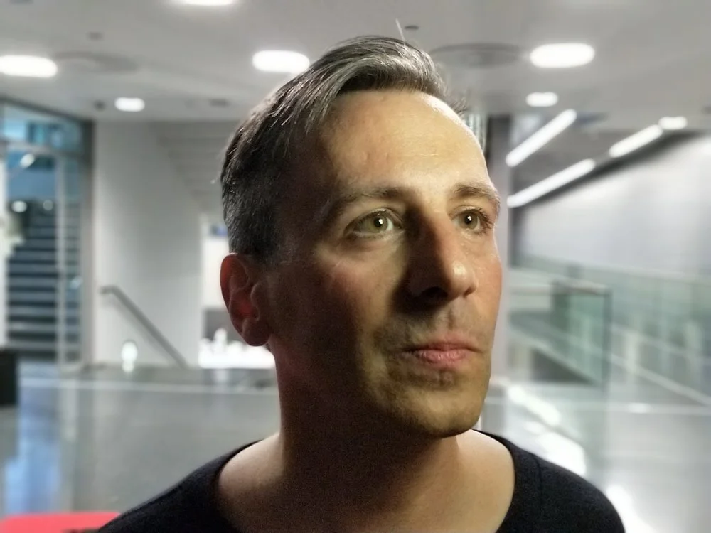
    1/35 f1.7 ISO2000
    1/35 f1.7 ISO2000

    1. Valon laatu ja luonne:
    Peter 8/10
    Matti 6/10  

    2. Valon väri
    Peter 5/10
    Matti 5/10

    3. Valon heijastuvuus
    Peter 6/10
    Matti 5/10

    4. Käytettävyys
    Peter 5/10
    Matti 4/10

    5. Kuljetettavuus
    Peter 9/10
    Matti 10/10

    6. Sotkun määrä eli lähinnä majoneesi (mitä enemmän majoneesia sen pienempi numero)
    Peter 2/10
    Matti 6/10

    Peterin havaintoja ja perusteluita:

    Big Macin boxin soveltui odotusten mukaisesti yllättävän hyvin valonmuokkaukseen. Boxin sisällä oleva valkoinen pinta on varsin kiiltävä ja heijastaa hyvin valoa. Se antoi valoa noin puolitoista aukkoa enemmän kuin Whopperin käärepaperi. Syykin on aika ilmeinen, Whopperin kääre on kierrätyspaperia eli on väriltään ruskea. Whopperin kääre antaa siis huomattavasti lämpimämmän sävyn valolle näistä kahdesta. Big Mac -boxin antama valo on aavistuksen kelmeää. Pieni värilämmön lisäys korjaa kuitenkin tilanteen. Varjojen luonne on aika samanlainen molemmilla valonmuokkaajilla. Whopper-kääreellä muokatussa kuvassa kontrasti on hiukan pienempi. Se johtuu pidemmästä valotusajasta ja isommasta ISO-arvosta. Whopperin valoteho on pienempi ja näin ollen ero valo- ja varjopuolella on pienempi, koska vallitseva valo lähempänä taskulampun heijastettua valoa. Whopperin heikompi heijastuvuus myös nosti kameran ISO-arvoa yli sen minkä OnePlus5 kestää. Se oli omiaan heikentämään kuvanlaatua.

    Silmän valopiste oli molemmilla aika miellyttävä. Big Mac -boxin muodostama valopiste on luonnollisesti neliö, joka joidenkin mielestä ei ole se paras muoto valopisteeseen silmässä. 

    Kuljetettavuudessa Whopperin kääre on selkeästi parempi. Se menee hyvin pieneen tilaan. Ainoa miinus on, että se voi sotkea kameralaukun majoneesiin. Big Mac -boxi menee ruttuun ja rikkoutuu helposti kameralaukussa. Boxi vie myös merkittävästi enemmän tilaa kuin käärepaperi.

    Käytettävyydestä on minun hankalampi sanoa, koska Matti toimi valaisumestarina. Yleisen tietoni mukaan molemmissa on käytettävyydessä hyvät puolensa. Whopperin kääre on muokattavissa ja sen kokoa voi muuttaa. Big Mac -boxin kannen kulmaa säätämällä saadaan valon suuntaa hiukan säädettyä. Whopperin kääreen silmään muodostuvaa valopistettä on valaistessa helpompi muokata haluamakseen.


    Matin mietteet:

    1. Valon laatu ja luonne:
    Big Mac: Hyvin muotoileva ryhdikäs ja yllättävän pehmeä läheltä valaistuna. 
    Whopper: Hieman epämääräinen, mutta silti muotoileva ja yllättävän toimiva.

    2. Valon väri:
    Big Mac: Ei muuta merkittävästi valonlähteen väriä, koska heijastuspinta on valkoinen.
    Whopper: Kääntää valon lämpimään, johon värilliset raidat tuovat maustetta.

    3. Valon heijastuvuus:
    Big Mac: Heijastaa hyvällä hyötysuhteella ja heikompikin valonlähde riittää.
    Whopper: Hukkaa turhan paljon valoa.

    4. Käytettävyys:
    Big Mac: Suhteellisen mukava pideltävä taskulampun kanssa. Helppo asetella kohdalleen ja suunnata valo. 
    Whopper: Hankala pidellä ja kaikin puolin epämääräinen, koska ei pysy muodossa. 

    5. Kuljetettavuus:
    Big Mac: Vie paljon tilaa, koska ei taitu litteäksi muodon kärsimättä. 
    Whopper: Mahtuu vaikka farkun taskuun tai melkein mihin vaan, eikä muoto tai valon laatu kärsi, vaikka rypistelystä.

    6. Sotkun määrä eli lähinnä majoneesi:
    Big Mac: Laatikkomaisesta rakenteesta johtuen on mahdollista saada lähes ilman majoneesia ja samasta syystä pienet roiskeet eivät haittaa käsittelyä heijastimena.
    Whopper: Kääreessä on luultavasti majoneesia yllinkyllin, mistä saa tahmeat sormet.

    Tulokset:

    Big Mac keskiarvo: 7,3
    Whopper keskiarvo: 5,9

    Valoaalloilla podcastin tiimi suosittaa valonmuokkaajaksi Big Mac -boxia.


    Valaisimena oli LED Lenser P14.2 taskulamppu. Sen valoteho on 350 lumenia. Valaisuperiaate oli klassinen eli noin 45-45 astetta. Kamerana testissä oli OnePlus 5 kännykkä. Kuvat kuvattiin sen Portrait-modella eli syvyystehoste oli käytössä. Kaikki kameran arvot olivat automaatilla. Mallina oli Martin-Éric Racine. Suuret kiitokset Martin uhrautumisesta! Minä otin kuvat ja Matti toimi ansiokkaasti valaisumestarina.

    McDonalds eikä Burger King ole tukenut eivätkä ole olleet mukana missään muodossa tässä valonmuokkaaja testissä. Molemmat valonmuokkaajat on hankittu omalla kustannuksella. (Söin ne lounaaksi ja koin hiukan vatsanväänteitä kuvaustilanteessa.)